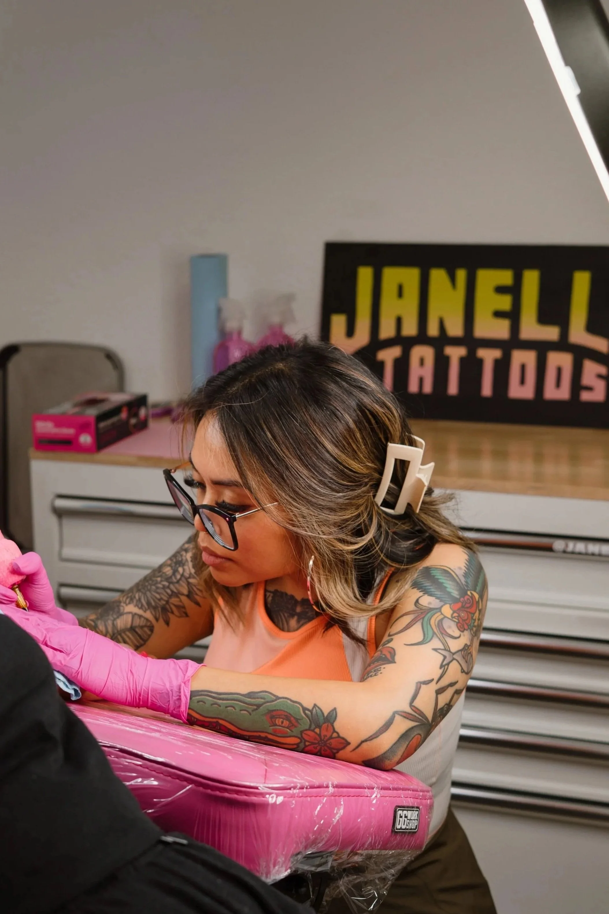
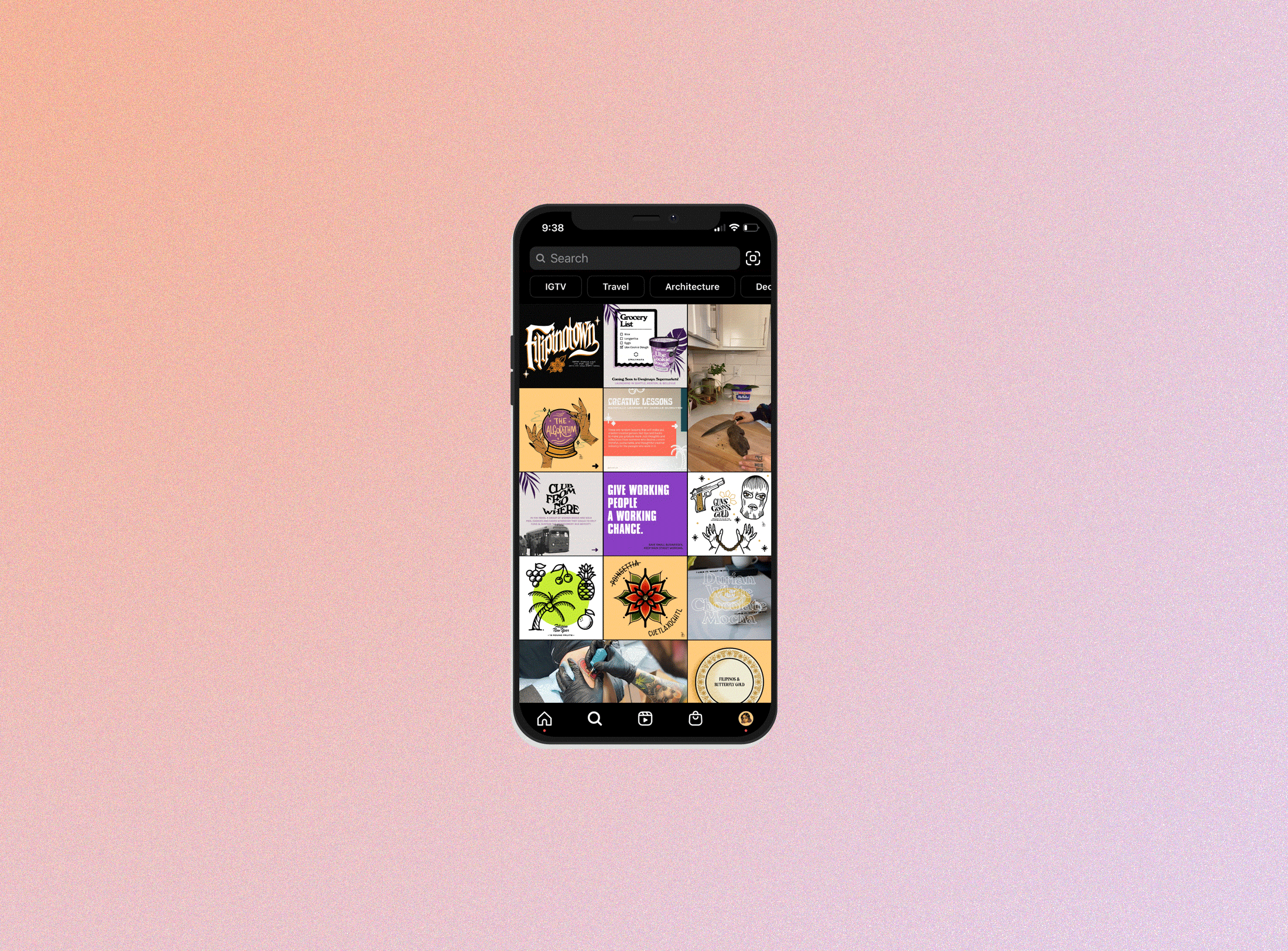
Mar 11
EMPOWR – Women's Empowerment Club
Poster to promote EMPOWR, a women’s empowerment club, at Seattle Central Community College.
She couldn't come up with a better name, so she took initials and abbreviated shit. So much for a creative professional. But not to worry - her expertise is not in copy-writing, but in Graphic Design. Janelle Quibuyen is a beast at creating beauty. And you're going to hire her.
Mar 11
Poster to promote EMPOWR, a women’s empowerment club, at Seattle Central Community College.
Mar 10
Women’s History Month is still going strong. Poster I did for a Women’s Health Fair on the SCCC campus – tomorrow!
Mar 3
Wow, it’s week 9 of the quarter and it’s coming to a close. My classroom has officially put up the finals calendar and it is crrrrunchtime. I basically have 3 weeks to do the following:
Letterhead, envelope, business card design
A full, working planner – printed and binded
A color theory movie poster + 1 more mystery assignment
Logo, [...]
Feb 19
That sounds so super official! Coz it is. I found some footage of Seattle Central’s 5th floor (aka Seattle Central’s “Creative Arts Academy”) so I thought I would share. Enjoy!
[youtube=http://www.youtube.com/watch?v=BrrWhAS104M]
Feb 11
I’s in an InDesign class this quarter. Let me just say, to all you .45 Kaliber Proof layout designers who made that beastly multipage zine with PHOTOSHOP, – my heart goes out to all of you. Myself included. What heaven I have found with .45KP in InDesign. Anyway, we’re learning basic techniques and for one [...]
Feb 10
For my New Media class on Fridays, we have different prompts every week that we have to write a blog about to be shared with all of our Creative Academy peers. This week’s prompt was to read an article about a copyright/trademark infringement case and our opinion on it. Here’s mine for the week:
The case [...]
Jan 8
Fresh out of my first day of Color Theory class, I’m a bit overwhelmed by how much there is to know about color. I’ve always been subjective when it comes to color – understanding the basic principles of opposites and complements, but really only honing down to “whatever looks good”. After a few hours of [...]
Jan 8
I’ve always had an appreciation for typography, especially in the sense that what ever it was you were trying to communicate could literally be done so with words, but in a visually appealing (and appalling) way. To this day, I’m still fascinated with type so you could understand my excitement for Typography I class this [...]
Jan 5
Well, it’s 1:46 in the morning and class starts in about 7 hours and I can’t get myself to sleep! This always happens, not being able to fall asleep when I need to get up early the next day. It’s a bad habit I need to kick. But at least it’s allowing me to post [...]
Dec 30
In Graphic Production I class, I had to demonstrate type attributes by recreating an album cover. Naturally, I chose a local artist – Nam, whose debut album, Exhale, released just this past summer.
I hate assignments like this where they tell you to make something but you have to have to include certain details (in this [...]